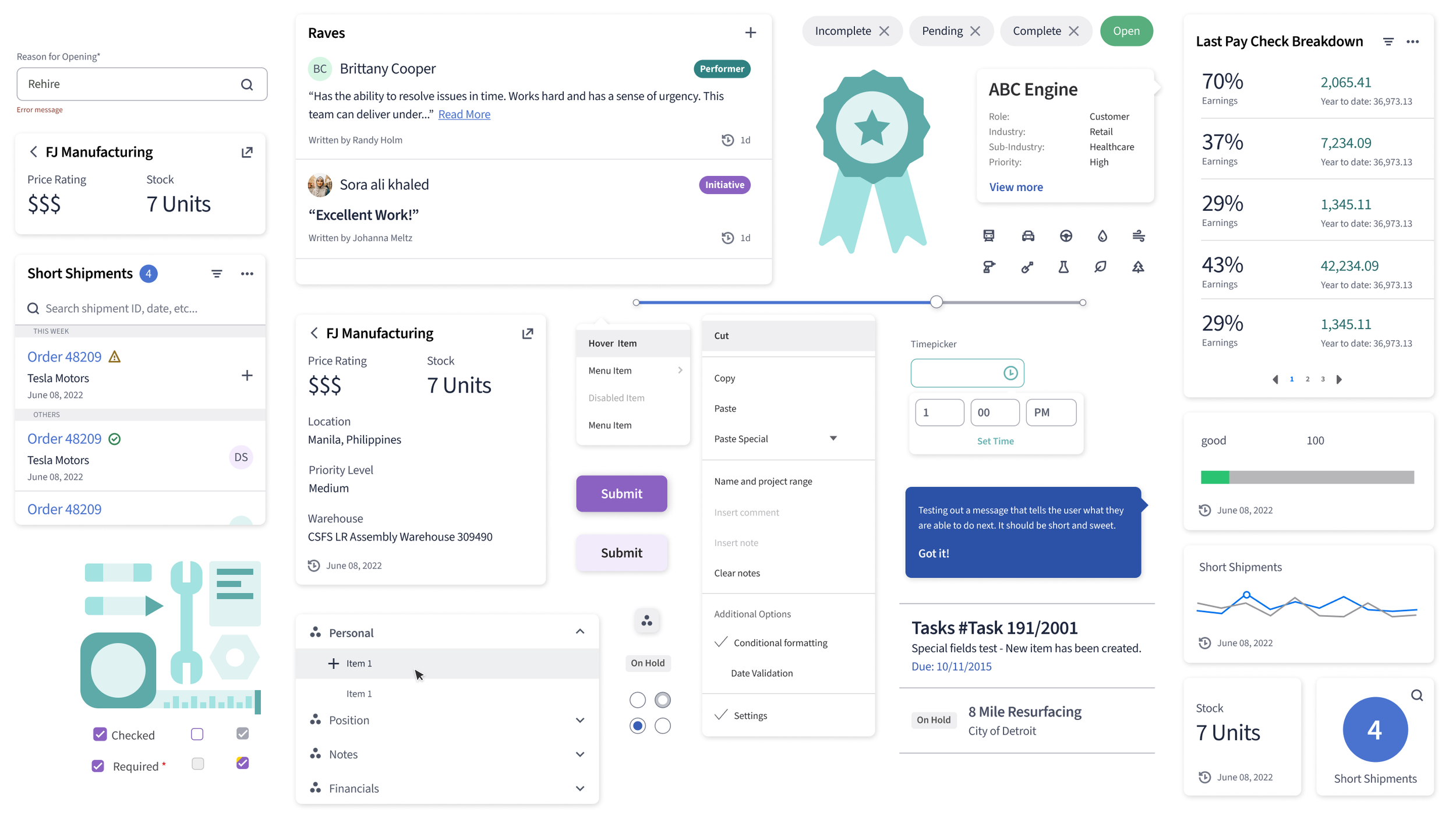
Infor’s Design System
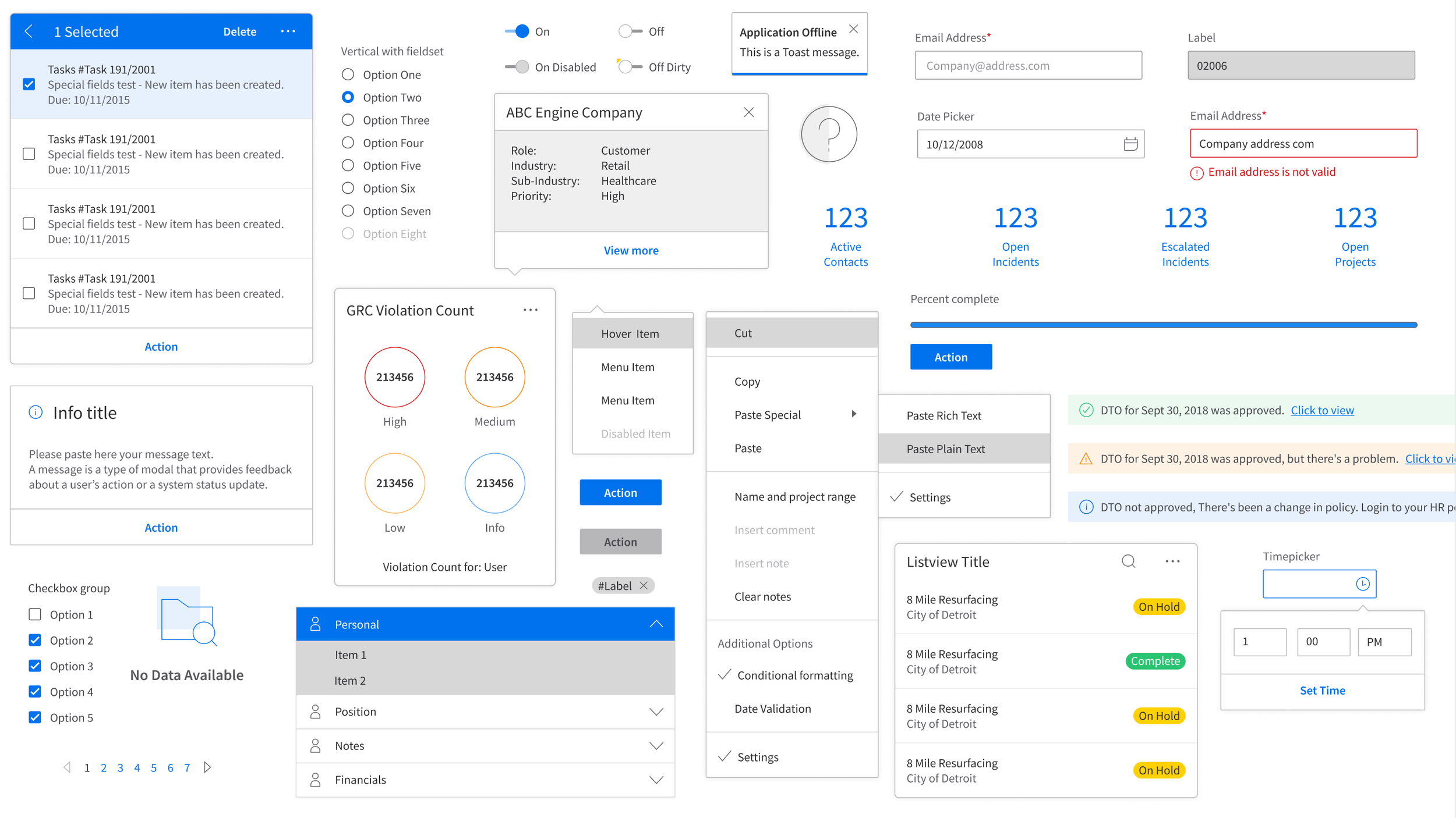
The Infor design system is a resource of tools, guidelines, and a little bit of inspiration for creating great experiences for Infor, our products, and our brand.
The why?
Enterprise software is very complex, and our mission at Infor is to help invoke a more human enterprise that ultimately transforms businesses, empower employees, and engage users.
Our goal with the design language is to make the design process more efficient, craft a memorable identity, and quickly improve usability across our suite.
We have to do this by establishing better foundations. Our mission is a more human enterprise.
“If you can't explain it simply, you don't understand it well enough"
Objectives
To build upon the current Infor design system to develop a new and more scaleable language. We want a more unified system that has accessibility and humanity at its core. These enhancements to the current system will help to scale UX & design as well as drive adoption and speed to market for our users.
Tasks
Evolve the existing Design Language and create the foundations for future versions to increase desirability & adoption
Manage Infor Design's Figma libraries to improve usage for sped to market and parody with our demo site
Create a future state of the current components to create a more scalable way for them to be produced and consumed throughout the enterprise.
Competitive Analysis
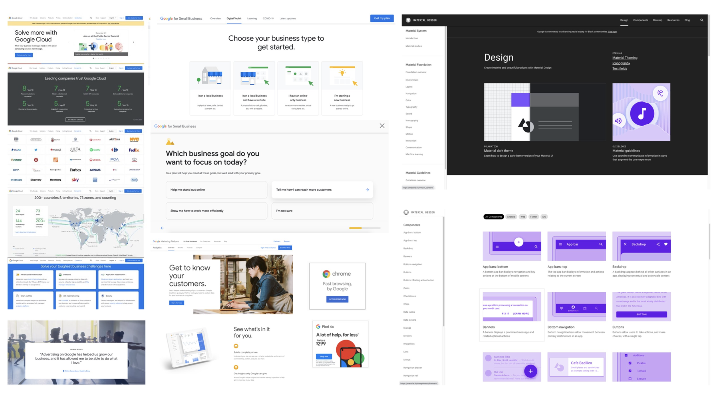
Material.io
Learnings:
https://material.io/ is one of the most robust systems out there in the product realm
Their education and enablement content is something for us at Infor to strive towards
Their design system site is cleanly structured and organized for all types of users i.e. design, developers, PM’s
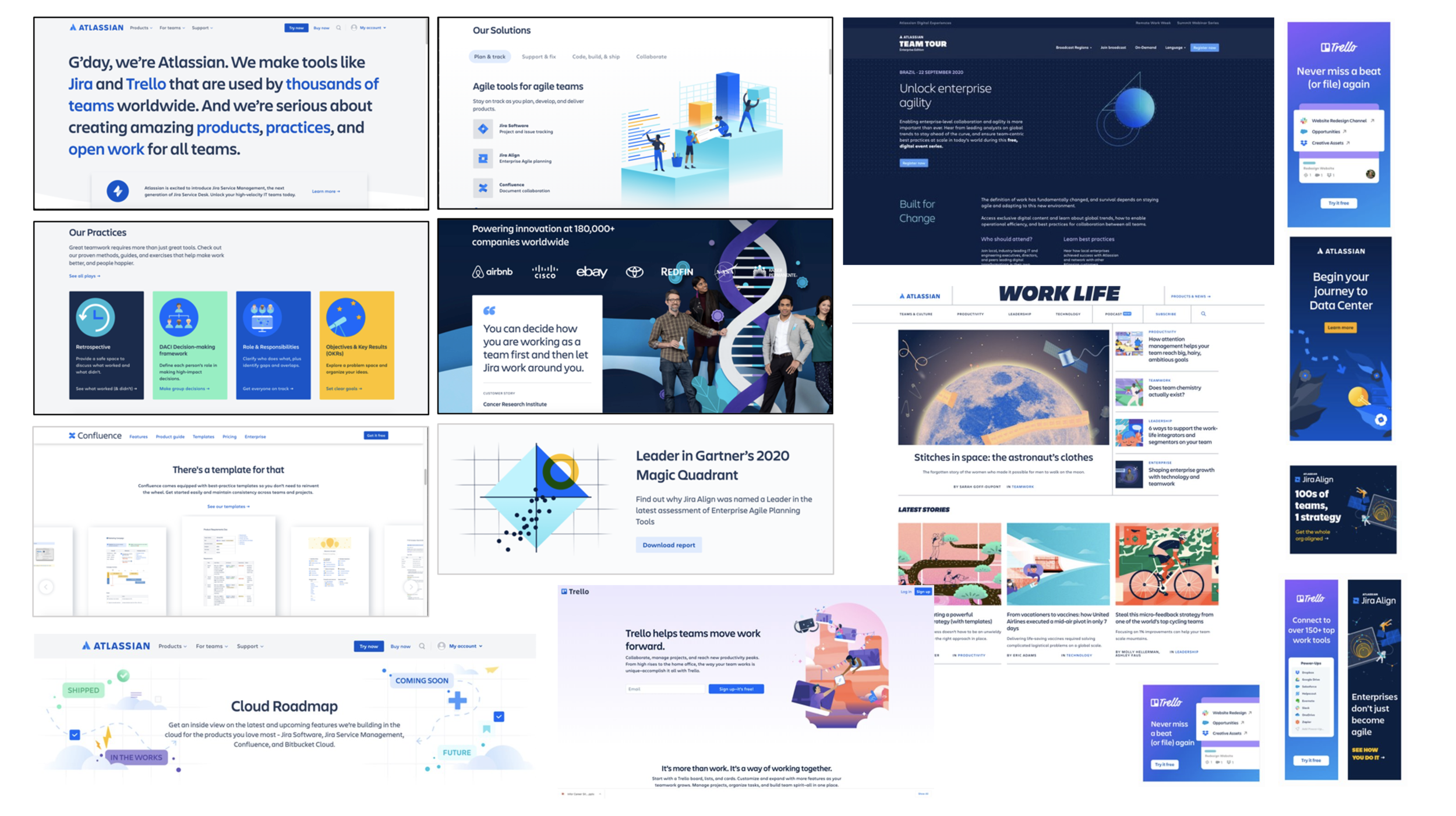
Atlasssian
Learnings:
Their design system site is cleanly structured and organized for all types of users i.e. design, developers, PM’s
They lock sections of their site that require employee credentials to access
Their tone of voice across their sits is something Infor should strive for
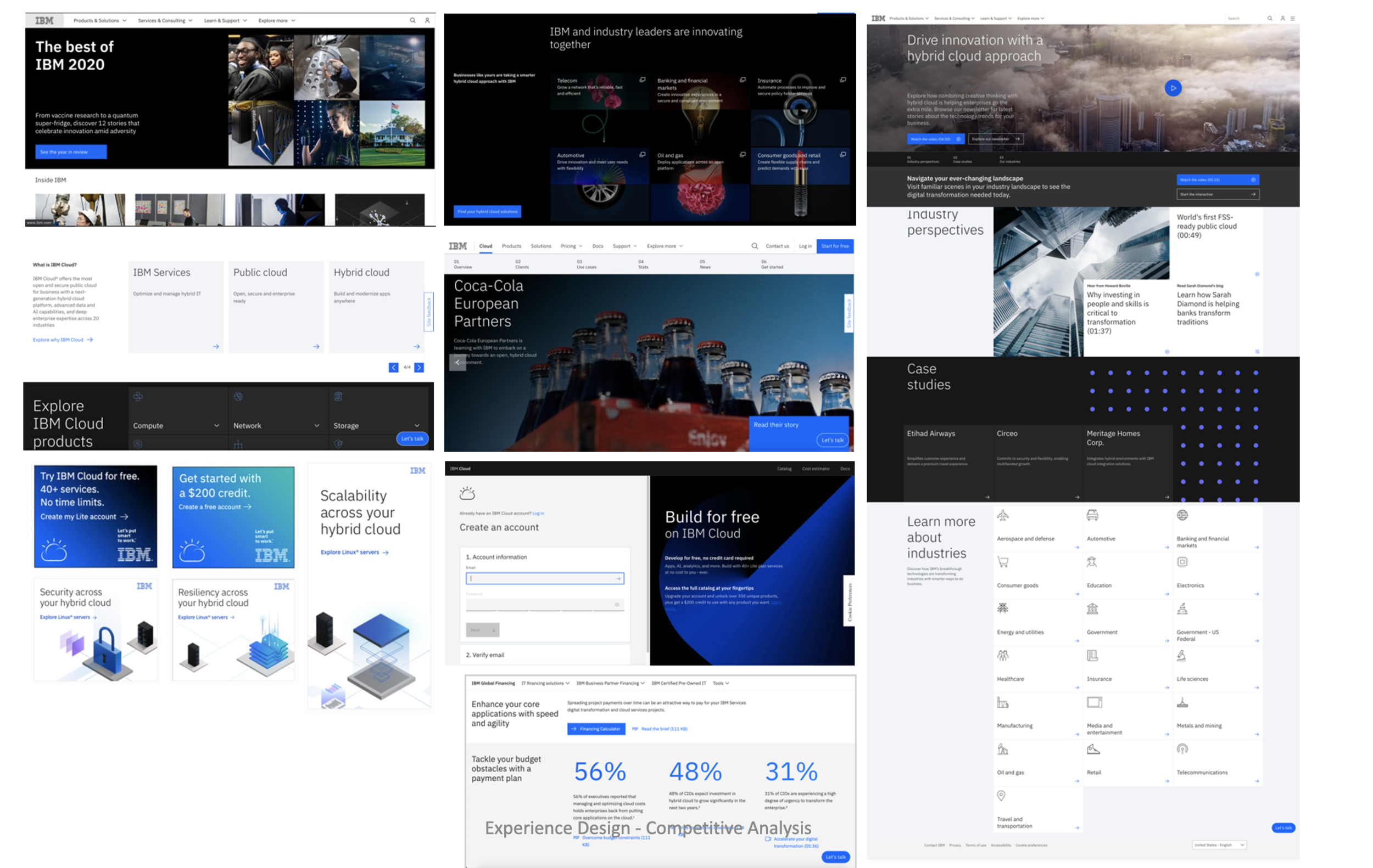
IBM
Learnings:
Their design system site is extremely robust and very segmented
Their use of page templates and tab structure to offer guidelines, code and usage is extremely successful
Personas:
After reviewing the list of potential user roles with IDS team leads, the following four roles were identified for the first round of user personas.
Infor Product Designer:
Covers the most ground for the designer group. Infor designers in New York probably have the most interaction with IDS, but it would be preferable to interview someone who doesn’t actively work on the product.
Application Developer:
Doesn’t interact with IDS as much as a platform developer, but might have a different experience that would be important to understand.
Product Manager & Business Analyst:
Covers the most ground for the product lead group.
Platform Developer:
Covers the most ground for the development group.
Color:
Some modifications made:
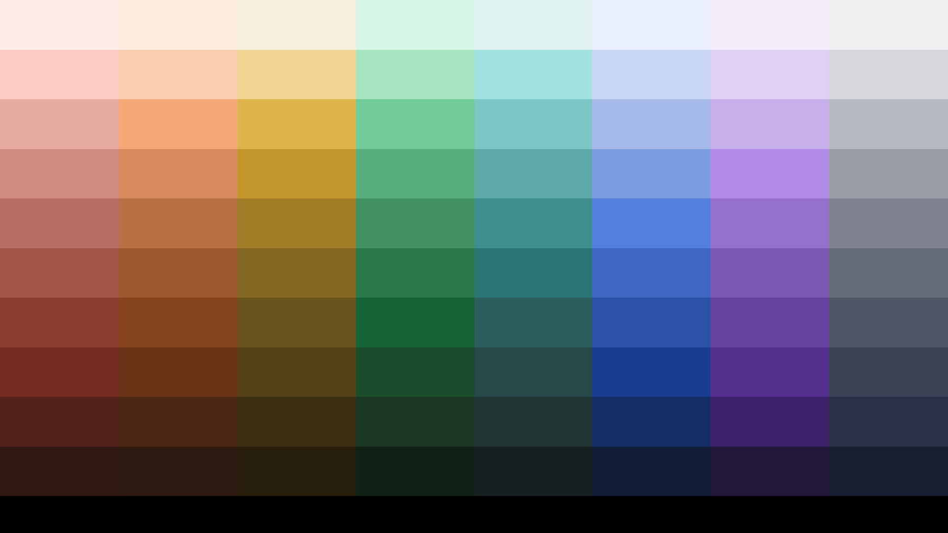
Consistent color ramp steps - making it so that steps between colors are consistent from theme to theme
Contrast is evenly split between the lightest 5 and darkest 5 - so there’s a switchover from black to white foreground elements
Considerations for our yellow hue, to make it appear more accessible.
The hues were combined with a scale of grays that was used as a rule for making steps more consistent throughout the color scales.
Because of this, accessibility contrast ratios became more predictable. For example, on a white background, all the 60 values pass accessibility AA. Whereas on a black background, all the 50 values pass AA.
Grid
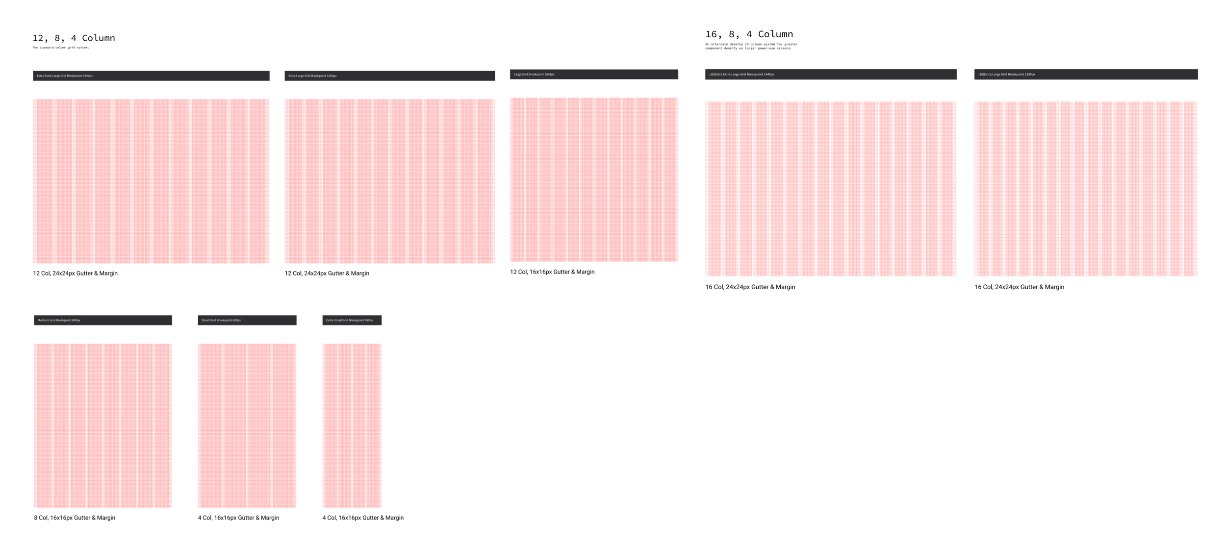
Grids scale based on screen size, and change to their respective breakpoints when scaled to certain dimensions mentioned above and below.
Our current grids are flat, too rigid, and not as responsive as our teams need.
The main changes are gutter and margin updates that also account for Infor's product complexity while leveraging the latest industry thinking around spacing, responsiveness, and adaptability.
The redesigned grid structure includes:
A margin!
More Columns (16-col option)
Rows for thinking vertically and harmoniously
We use 12 columns at desktop (1280, 1440, +) breakpoints.
12 columns at small desktop (1024) *New*
8 columns at (840)
4 is used for small tablets (600)
phones (360).
Our margin for desktop screens is set at 24px, while small desktop, tablet and phone screens use a 16px margin for maximum screen space utilization.1px system icons created as an uplift of current SoHo icons. Along with re-skinning the need for larger more illustrative icons for branding and product use.
Type
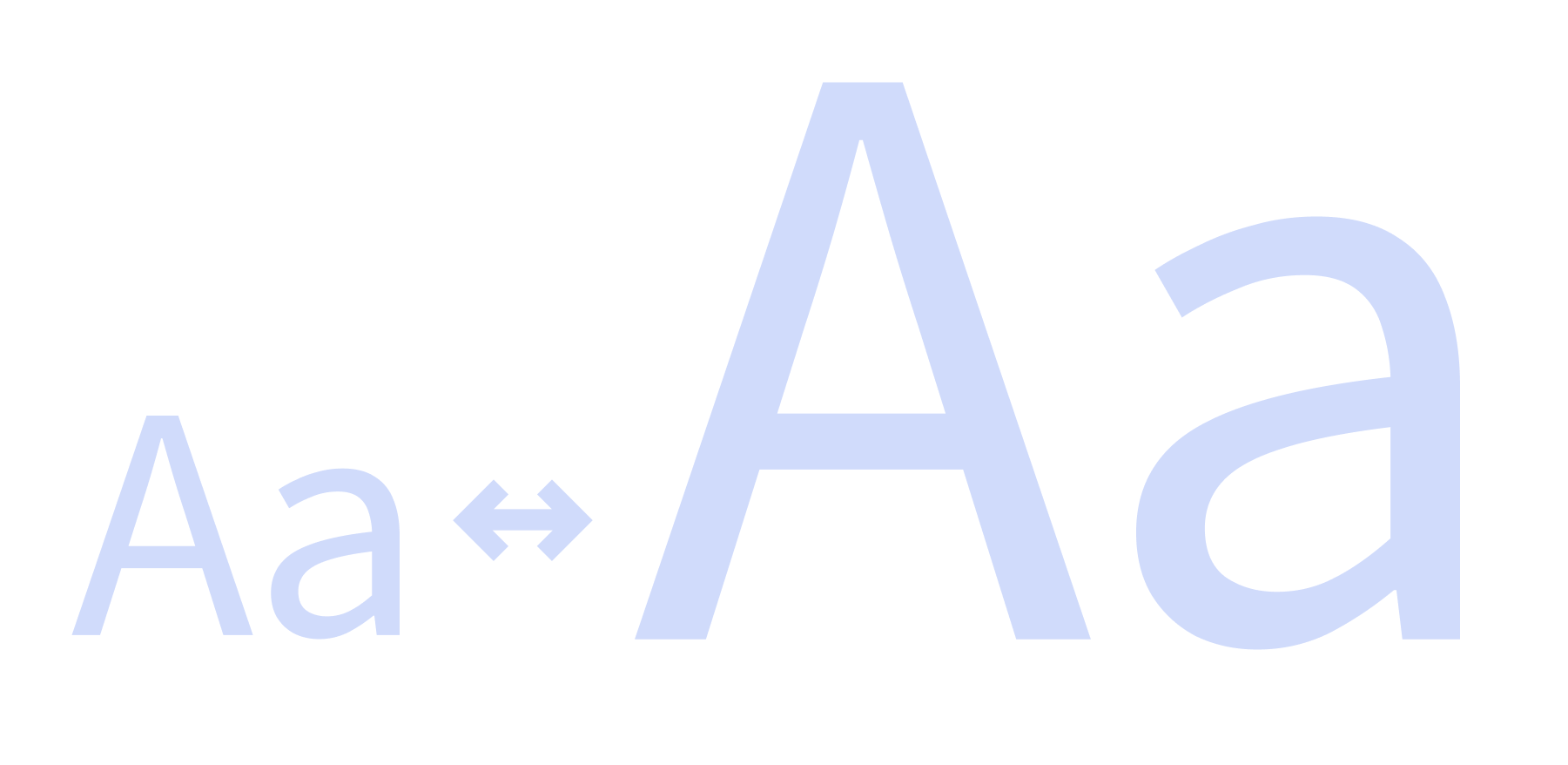
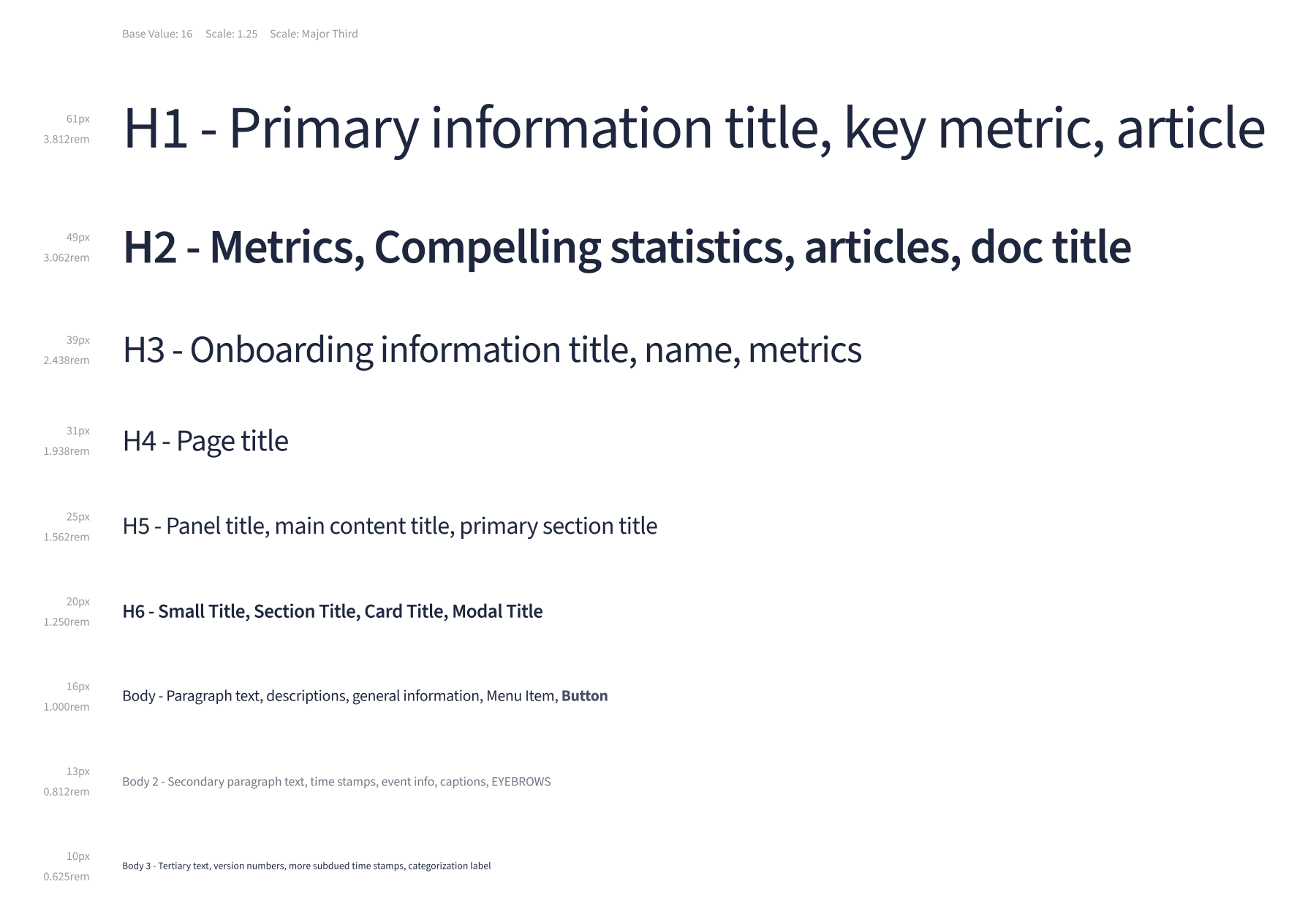
Sticking with Infor’s current brand fonts, we decided to stay with the use of Source Sans. Our goal is to offer additional styles & weights for more flexible use. As well as taking a POV on type scale for screen density and industry/product needs.
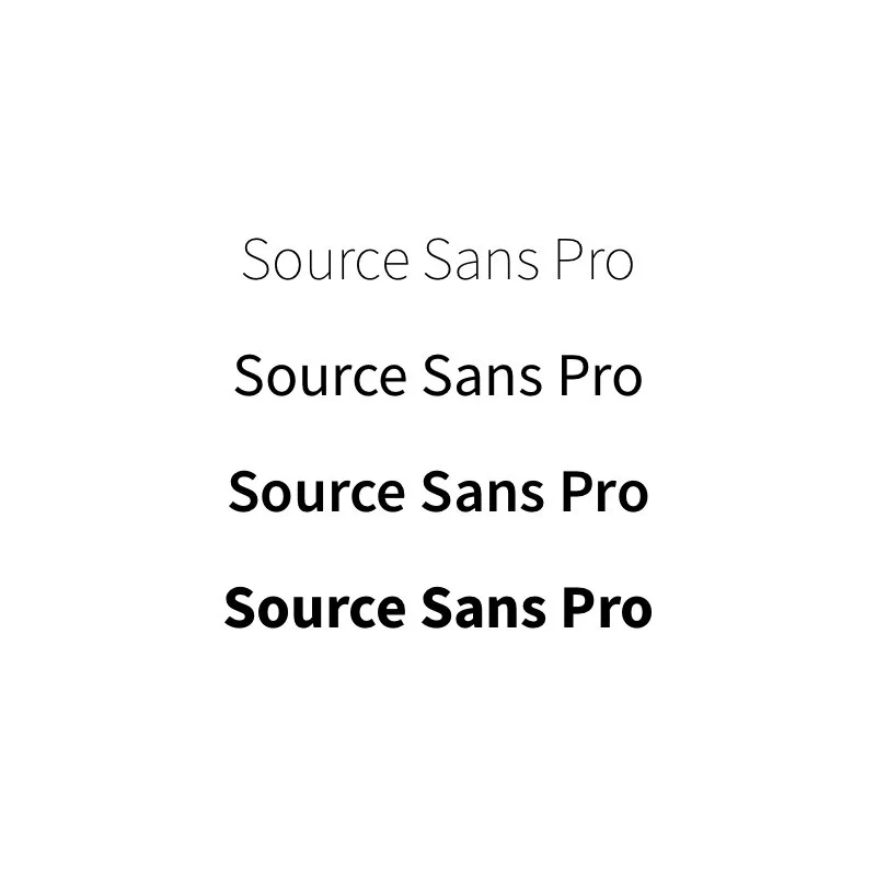
Source Sans Pro is an open-source grotesque typeface designed by Paul D. Hunt for Adobe Systems. The design was inspired by American gothics, however, some traits such as the tail on the lowercase l are more reminiscent of humanist typefaces.
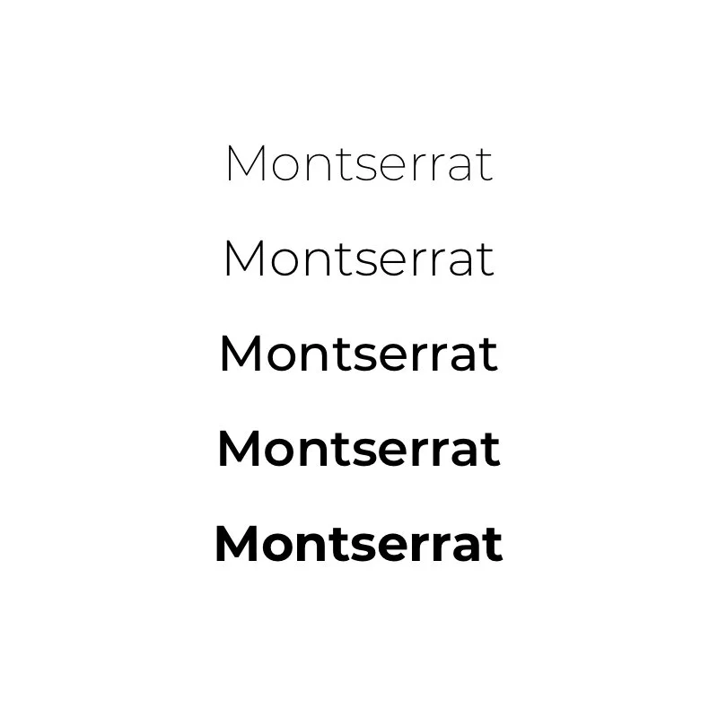
Montserrat is a geometric sans-serif typeface designed by Julieta Ulanovsky, inspired by posters and signage from her historic Buenos Aires neighborhood of the same name. It is rather close in spirit to Gotham and Proxima Nova, but has its own individual appearance—more informal, less extended and more idiosyncratic.
Conclusions
A design system is never complete
Solid foundations are key to success
Testing takes time and you need a lot of insights to make data driven decisions.
Next steps
Continue to test additional foundations, elevation, motion, establish a clear tone of voice
Work with development to get design & dev tokens to be 1:1
Establish a theming definition
Work on additional UI & clean up patterns
Create additional Figma libraries for enablement within the company
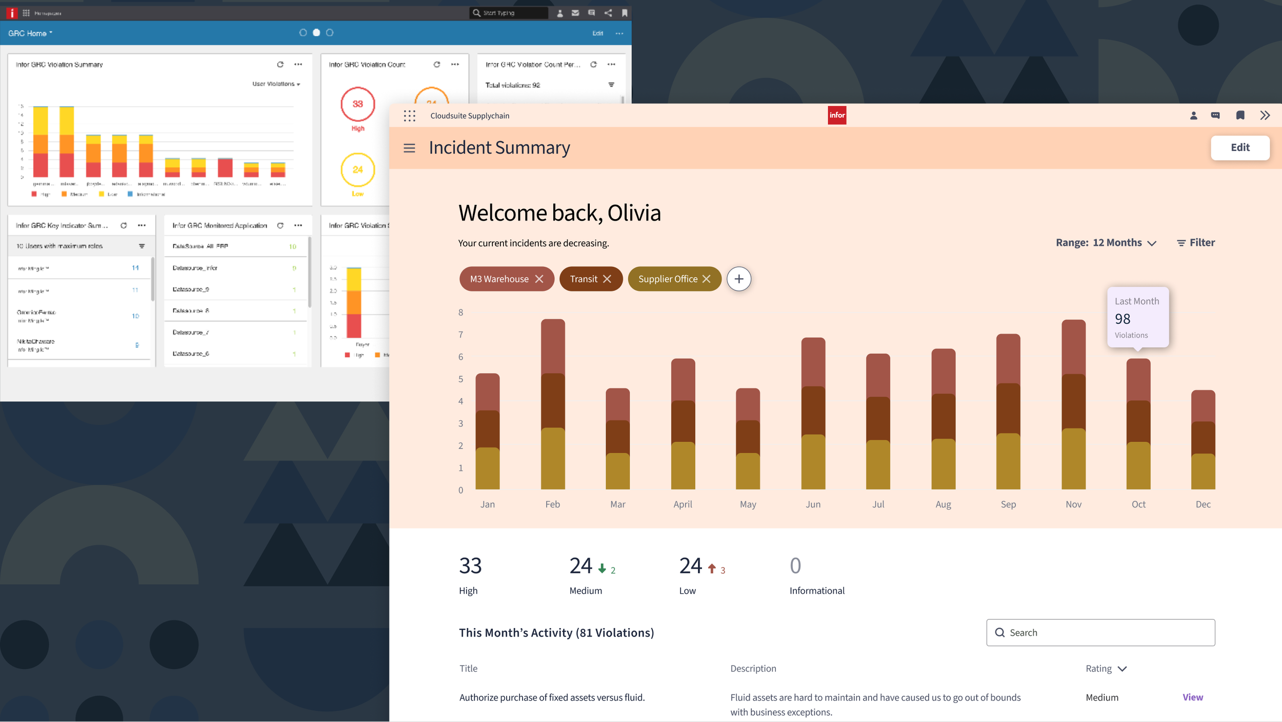
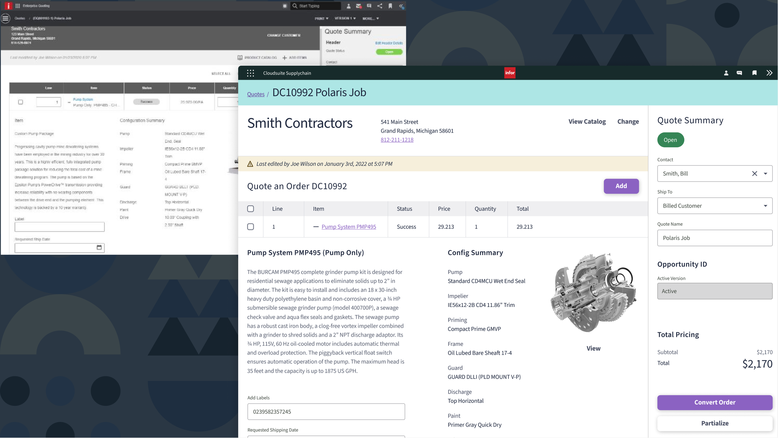
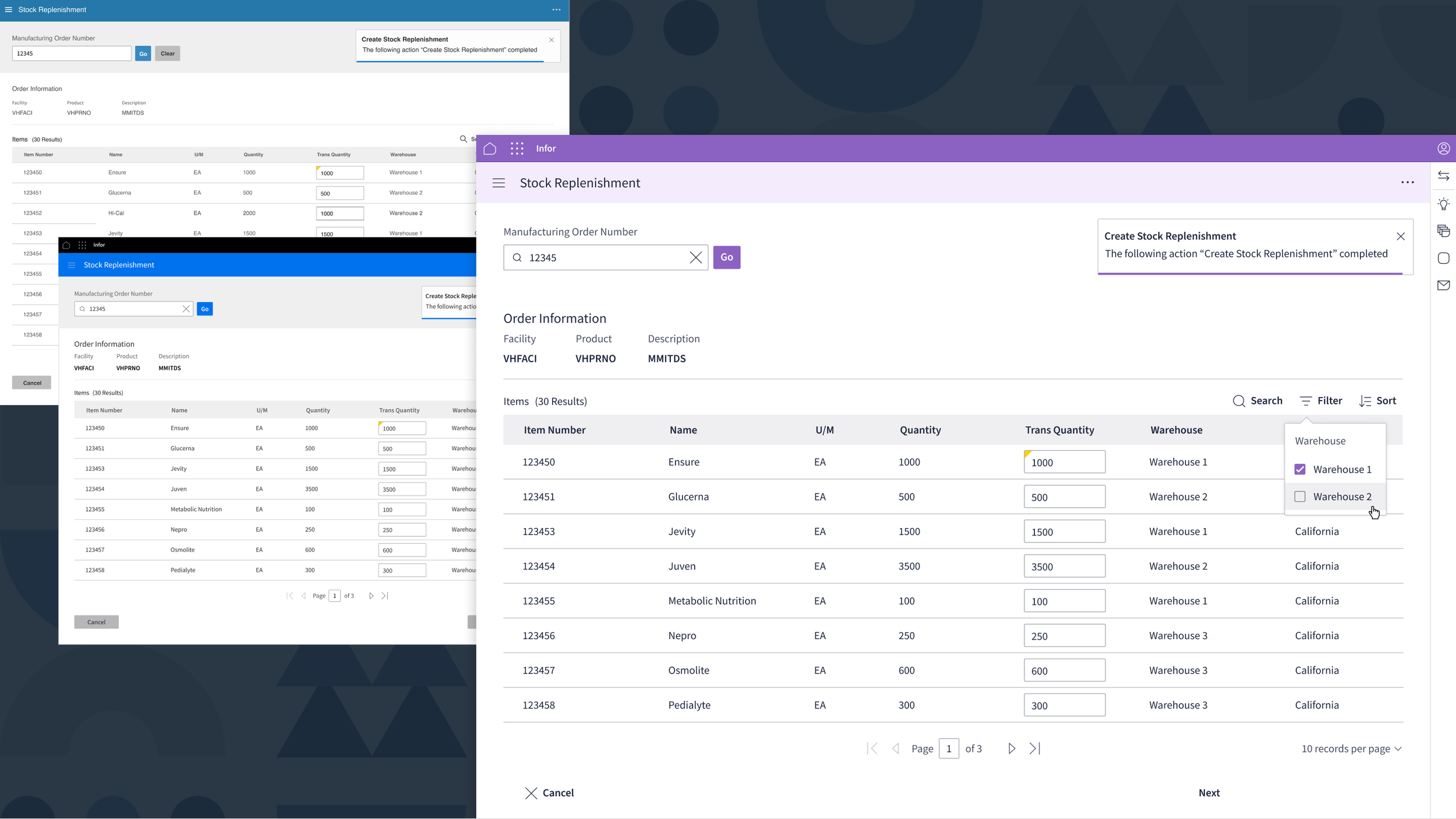
The foundational aspects of the new IDS 4.5 version consisting of colors/type/ icons.
The team is working on building out all states and completing comprehensive documentation for all of the current components to create a more in-depth, scaleable design language